
Visualizing data effectively is paramount in conveying the importance of energy conservation, especially as climate change continues to pose a significant threat to our environment. Charts serve as visual tools that can distill complex information into understandable formats. For anyone seeking to highlight the significance of energy conservation through data visualization, knowing how to create a compelling chart is essential. This guide outlines a comprehensive approach to crafting charts that not only represent data accurately but also resonate with your audience’s understanding of energy conservation.
To initiate the chart-making process, one must first define the objectives of the visualization. What message are you trying to convey? Are you focusing on energy consumption patterns, comparing different energy sources, or showcasing the impacts of energy conservation? Clear objectives lay the foundation for purposeful data collection and chart design.
Once objectives are established, it is crucial to gather relevant data. Utilizing reputable sources ensures accuracy and credibility. Options include government databases, environmental organizations, and academic publications. Data concerning energy usage over time, different types of energy sources, or regional comparisons can illuminate trends and patterns. It is imperative to ensure the data is recent and reflects the complexities of energy consumption, as outdated information can mislead viewers.
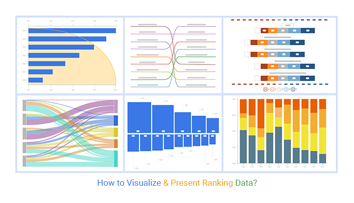
Following data collection, the next step is to choose the appropriate type of chart. There are various chart types, each tailored for specific data representations. For example, bar charts effectively illustrate comparisons between different energy sources, while line graphs can track energy usage trends over time. Pie charts may be suitable for displaying the percentage contributions of various energy sources to total consumption. Understanding the strengths and weaknesses of each chart type is critical for selecting one that aligns with your message.
Having identified the chart type, attention must shift to the design elements. An effective chart should be visually engaging yet simple. The use of colors, fonts, and shapes plays a vital role in drawing attention to key data points. Colors can be leveraged to signify different categories, such as renewable versus non-renewable energy sources, allowing viewers to quickly differentiate between data sets. Additionally, ensuring your chart has an appropriate scale is crucial; a misleading scale can distort perceptions of the data you present.
Labels are another essential aspect of chart design. Ensure that axes are clearly labeled, with units of measurement specified. Titles should succinctly describe the content while inviting viewers to explore the data. Providing context, such as time frames or geographical locations, enhances the audience’s comprehension. Consider adding annotations to highlight significant findings or trends, guiding the viewer’s focus toward essential insights.
Furthermore, interactivity can enhance the effectiveness of a chart. Tools and software that allow users to hover over parts of a chart to reveal more detailed information can make the data more engaging. Interactive elements encourage deeper exploration of the data, granting viewers the ability to investigate specific components that pique their interest. This engagement is vital, particularly when addressing the complexities surrounding energy conservation.
Once the initial design is completed, it is critical to seek feedback. Presenting your chart to peers for review ensures that your data is interpreted accurately. Feedback can highlight areas for improvement or suggest additional elements that may bolster the effectiveness of your visualization. Revising your chart based on this constructive criticism is imperative for fine-tuning your communication tool.
After incorporating feedback, the final touches can be made before releasing the chart to your intended audience. Consider the various platforms on which the chart will be shared. Charts intended for social media may require a different design aesthetic compared to those meant for academic presentations or reports. Tailoring your presentation style according to the audience ensures maximum impact.
Implementing charts as part of a broader initiative promoting energy conservation can amplify the message significantly. Consider employing your charts alongside written narratives, infographics, or presentations to deliver a comprehensive message. A cohesive strategy that blends visual data representation with compelling storytelling can elevate the discourse surrounding energy conservation.
In conclusion, crafting a chart to visualize energy conservation data entails a systematic approach, from defining objectives and gathering relevant data to selecting an appropriate chart type and refining its design. When executed well, charts can act as powerful instruments to illuminate the critical message about energy conservation. Such visualizations do not merely represent data; they evoke understanding, prompting action in the face of climate change. The clear and effective communication of energy conservation data ultimately contributes to a more informed audience, better equipped to engage in sustainable practices that benefit both the environment and society at large.