

Climate maps are indispensable tools for understanding the complex interactions between our planet’s weather patterns and the ecosystems that inhabit it. Delving into the nuances of climate mapping can unveil the hidden stories of the Earth’s atmosphere and help us better comprehend the implications of climate change. This article will explore what a climate map is, the various types of climate maps, how to read them, and the significance they hold for environmental stewardship.
Understanding Climate Maps
At its core, a climate map is a visual representation that displays average weather conditions over time in a particular area. These maps utilize data on temperature, precipitation, humidity, and other atmospheric factors to characterize a region’s climate. Unlike weather maps, which depict short-term atmospheric conditions, climate maps provide a longer-term view, often spanning decades or even centuries.
The aesthetic appeal of these maps is undeniable; vibrant colors and dynamic shading illustrate different climate zones, transforming data into visual art. From the icy blue hues representing polar regions to the warm reds and yellows of arid deserts, each color gradient tells a story—a tapestry woven from environmental statistics and geographic influences.
Essentially, climate maps can be categorized by their focus, offering insights into specific elements of the climate system. These maps provide a visual context that can elevate our understanding of climate behavior and its implications for human and ecological systems.
Types of Climate Maps: A Kaleidoscope of Information
Climate maps come in various types, each serving a unique purpose. Understanding these varieties can enhance your ability to interpret and utilize the information they present.
Precipitation Maps
Precipitation maps illustrate average annual rainfall or snowfall in a given region. By displaying how much moisture an area typically receives, these maps enable predictions about agricultural viability and water resource management. For instance, lush green areas on a precipitation map suggest regions favorable for farming, while arid zones indicate scarcity.
Temperature Maps
Temperature maps depict average temperature variations across different seasons or over the course of the entire year. These maps not only highlight hot and cold zones but also contextualize shifts in temperature that result from climate change. Melting ice caps and the increasing frequency of heatwaves can both be traced through these visual tools, prompting critical discussions on adaptation strategies.
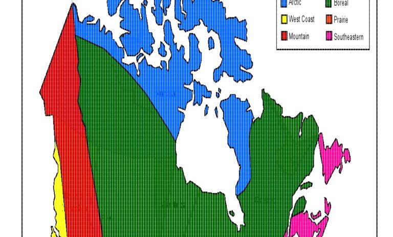
Climate Zone Maps
A climate zone map categorizes different regions based on their predominant climate types, such as tropical, temperate, or polar. The Köppen climate classification system is a popular framework used to illustrate these distinctions. This categorization helps in understanding biodiversity, ecosystem dynamics, and even the socio-economic implications of climate types. Notably, each zone offers a unique habitat for various flora and fauna, intertwining human activity and natural landscapes.
How to Read a Climate Map: Decoding the Symbols
Deciphering a climate map may seem daunting at first, but a methodical approach can unravel the wealth of information embedded within. Here’s how to effectively interpret these vital representations of climate data.
Examine the Legend
The legend is a crucial key to understanding any climate map. It includes symbols, color coding, and scales that describe what each hue or symbol signifies. For example, dark blue might represent high rainfall, while shades of yellow indicate low precipitation. By familiarizing yourself with this legend, you can start making sense of the visual data.
Identify Geographic Context
Always consider the geographic context of the climate map. Identify features such as mountains, rivers, or urban areas that may influence local climate. The orographic effect, where mountainous regions receive more rainfall than low-lying areas, is a critical point to keep in mind.
Analyze the Data Trends
Look for patterns and trends in the data presented. For instance, an observed increase in average temperatures over the years can indicate the onset of global warming. Similarly, shifts in precipitation distribution might reveal changing weather patterns that affect crop yields and water availability. Being attentive to these trends enables you to grasp the broader implications of the climate in question, leading to more informed decisions regarding conservation and environmental policies.
The Broader Significance of Climate Maps
Climate maps are not merely academic tools; they are vital in shaping our responses to environmental challenges. As climate change continues to accelerate, understanding these maps becomes imperative for informing policies related to environmental conservation, urban planning, and disaster management.
In essence, climate maps serve as a bridge between raw data and actionable insight, allowing individuals, communities, and governments to navigate the complexities of climate science. Through informed decision-making, we can foster a sustainable relationship with our planet, ensuring its health for generations to come.
In conclusion, climate maps unveil a narrative that guides our understanding of weather patterns and climate changes. Grasping how to read these informative tools allows us to engage with our environment more meaningfully, ultimately empowering us to act as custodians of the planet. So, the next time you encounter a climate map, take a moment to explore the deeper stories it offers, and consider its significance in the critical fight against climate change.