

In a world where visual representation reigns supreme, diagrams serve as powerful tools for synthesizing complex scientific concepts into more digestible formats. One such concept that intricately intertwines with our everyday existence is the greenhouse effect. Have you ever paused to wonder how a simple illustration can illuminate the nuances of this crucial phenomenon? Let’s delve into the intricacies of the greenhouse effect and examine how a well-crafted diagram can demystify its workings.
Understanding the greenhouse effect is essential for grasping the broader implications of climate change, global warming, and their cascading effects on our planet. By breaking this phenomenon down visually, we can acknowledge its importance while also recognizing the emerging challenge posed by anthropogenic activities.
To embark upon this exploration, it’s imperative to first establish what the greenhouse effect is and how it operates.
The Mechanisms of the Greenhouse Effect
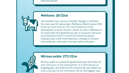
At its core, the greenhouse effect refers to the process by which certain gases in our atmosphere trap heat from the sun. This phenomenon is both natural and essential, as it maintains the Earth’s temperature at a level conducive to supporting life. Key gases involved include carbon dioxide (CO2), methane (CH4), and nitrous oxide (N2O). These gases essentially create a thermal blanket around our planet.
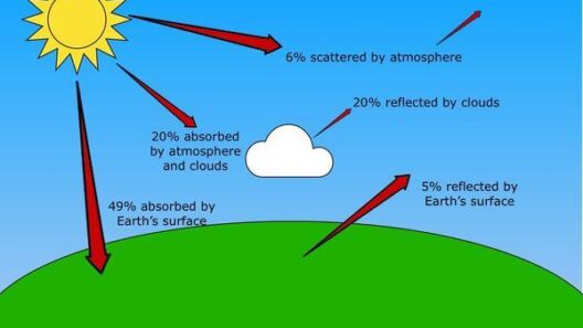
Visual representation can effectively showcase how solar energy interacts with the Earth’s atmosphere. A diagram typically illustrates the sun’s rays penetrating through the atmosphere, where a portion is reflected back into space, while others are absorbed by the Earth’s surface. This portion, in turn, radiates energy back into the atmosphere as infrared radiation. Herein lies the crucial step: greenhouse gases reabsorb some of this outgoing infrared radiation, effectively warming the atmosphere—a process that can be whimsically likened to a cozy thermal blanket on a chilly night. The diagram may also depict the increasing concentration of these greenhouse gases due to human activities, adding an ominous layer to this otherwise warm and nurturing scene.
Visual Learning: The Power of Diagrams
Diagrams function as a springboard for comprehension, transcending linguistic barriers and enhancing the retention of complex scientific principles. By juxtaposing the intricate relationships between solar radiation, atmospheric composition, and Earth’s temperature, visual aids provide clarity that text-heavy explanations often lack.
A well-illustrated diagram of the greenhouse effect may delineate layers of the atmosphere, showcasing where various gases reside. Using color coding, it can indicate which gases are responsible for the warming effect and their relative concentrations over time. Additionally, animated representations can engage viewers emotionally, fostering a sense of urgency regarding environmental action.
Moreover, when one encounters a visual representation of the greenhouse effect, it becomes easier to appreciate the interconnectedness of systems on our planet. It’s almost like piecing together a grand puzzle, where each component plays a significant role in maintaining ecological balance.
The Environmental Impact: Unpacking Human Contributions
Equipped with a solid understanding of the greenhouse effect, we can now delve into the substantial environmental implications stemming from human-induced alterations to this natural phenomenon. As warming trends escalate, the widespread consequences demand our attention.
Our modern lifestyles predominantly fuel an uptick in greenhouse gas emissions. From transportation to industrial processes and deforestation, each action reverberates through the atmosphere. A striking diagram can juxtapose pre-industrial atmospheric gas concentrations against current levels, creating a visual narrative of change that is hard to ignore.
Furthermore, such illustrations can elucidate the feedback loops involved in this phenomenon. For instance, as global temperatures rise, polar ice caps melt, releasing more CO2 and methane trapped in the permafrost. This cycle of heat retention exacerbates climate change, and understanding this through visual media is pivotal for driving home the message of urgency.
Envisioning a Greener Future: The Role of Visual Advocacy
What if diagrams could inspire a generation to take action? The potential of visual representations to mobilize public consciousness and adapt behaviors cannot be underestimated. Inviting viewers to participate in the dialogue surrounding the greenhouse effect fosters a community eager for solutions.
By utilizing art, infographics, and interactive diagrams in educational settings, we can cultivate an informed populace. Such visual advocacy not only encourages knowledge but also nurtures a sense of responsibility towards preserving our environment. Enhanced awareness can lead to individual and collective actions, from reducing carbon footprints to advocating for sustainable practices.
In summary, visual representations of the greenhouse effect serve as crucial educational tools, enabling individuals to grasp the significance of this phenomenon while motivating them to act. By exploring the mechanisms, implications, and potential for advocacy, we can create a tapestry of understanding that propels us toward a sustainable future. Are we prepared to take up the challenge posed by the visual narrative of the greenhouse effect and emerge as proactive stewards of our planet? The answer lies within each of us, guided by knowledge and bolstered by action.