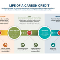
A climate map is an indispensable tool used to visualize the myriad weather patterns that exist across the globe. By distilling complex atmospheric phenomena into easily interpretable visuals, these maps facilitate a greater understanding of our planet’s diverse climatic zones. They serve not only as educational resources but also as vital components for research, urban planning, and environmental advocacy. In essence, a climate map encapsulates various atmospheric variables, including temperature, precipitation, humidity, and wind patterns, enabling observers to discern the intricate tapestry of global weather systems.
The fascination with climate maps stems from a fundamental human instinct: a desire to comprehend the world around us. Observers may marvel at how vastly different regions can experience intense weather variations, often within the same month or season. For instance, while a heatwave engulfs one part of the world, its counterpart may be grappling with relentless monsoons or fierce blizzards. It is this juxtaposition that ignites curiosity and prompts deeper inquiries into the underlying reasons for such climatic disparities.
Climate maps can be perplexingly complex, yet their visual simplicity often belies the intricate science behind their creation. The basis of any climate map lies in data collection. Meteorologists gather extensive datasets from a network of weather stations, satellites, and ocean buoys. These data points are then assimilated using comprehensive algorithms and modeling techniques that account for myriad factors influencing climate—topography, ocean currents, solar radiation, and atmospheric composition, among others. The result is an intricate quilt of colors and symbols that depict various climatic conditions around the globe.
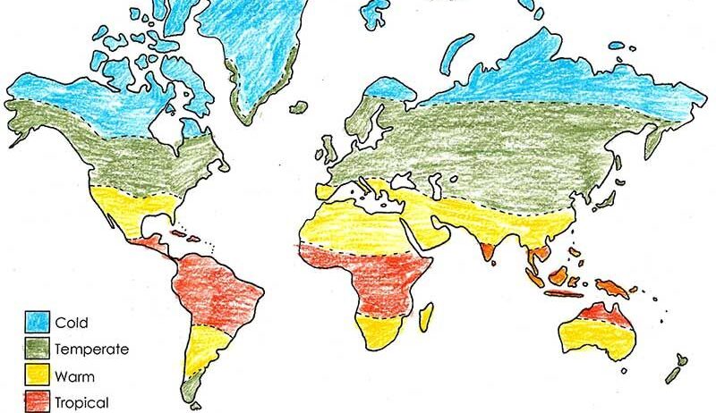
To categorize climate, scientists often refer to the Köppen Climate Classification System, which segments the globe into five primary types: tropical, arid, temperate, cold, and polar. Each of these categories is further subdivided based on specific precipitation and temperature patterns. A climate map utilizing this classification system can transparently reveal not only the present climatic realities but also projected future scenarios influenced by climate change.
One salient feature of climate maps is their capacity to forecast long-term trends. By visualizing historical climate data alongside contemporary observations, users can identify shifting patterns. For instance, regions that have traditionally experienced mild temperatures may, due to climate change, display abnormalities such as unprecedented heat or unusual precipitation levels. This predictive power becomes crucial for policymakers, allowing them to anticipate and mitigate the adverse effects of climate change in vulnerable regions.
Moreover, climate maps can serve as a clarion call for environmental action. They can vividly articulate the effects of human activity on delicate ecosystems, such as deforestation and fossil fuel consumption. For example, a map illustrating increasing temperatures across a region may indicate the potential for severe drought conditions, which can detrimental impacts on agriculture and water supply. In such instances, climate maps not only illuminate current trends but also inspire collective action to implement sustainable practices.
One noteworthy aspect of climate mapping is its intersection with socio-economic factors. The geographic distributions of wealth, food security, and health are often intricately tied to climate zones. Regions classified as arid are more susceptible to food shortages, impacting local economies and community resilience. Conversely, temperate zones generally benefit from more stable agricultural productivity. A comprehensive climate map can elucidate these critical interconnections, underscoring the need for targeted interventions that take local climatic conditions into account.
In addition to their practical applications, climate maps possess an aesthetic quality that captivates the observer. The vibrant hues representing various temperatures and precipitation levels create an almost artistic portrayal of our planet’s climatic intricacies. This inherent beauty can evoke a profound emotional response, motivating individuals to engage in conversations surrounding climate advocacy and environmental conservation. The striking visuals of climate maps can serve as powerful catalysts for change, inspiring individuals to reflect on their relationship with nature and their responsibilities toward the environment.
Furthermore, the rise of technology has propelled climate mapping into new territories of sophistication. Geographic Information Systems (GIS) and advanced satellite imagery allow for real-time data synchronization, enabling more accurate visualizations of climate dynamics. These technological advancements facilitate a nuanced understanding of local variations within global patterns, thereby fostering a more comprehensive grasp of climatic phenomena. Interactive climate maps, which allow users to delve deeper into specific regions, provide an immersive experience that encourages exploration and understanding of complex environmental systems.
In conclusion, climate maps serve a multifaceted role in our understanding of the atmospheric processes that govern our planet. They represent the foundational element of climate science, yet their implications extend far beyond mere data visualization. As they succinctly capture weather patterns, they also reveal interconnected socio-economic realities and inspire urgent environmental action. The visual appeal of a climate map can spark curiosity, prompting society to investigate and address the underlying factors contributing to climate change. Ultimately, these maps not only remind us of our planet’s beauty and diversity but also compel us to consider the future we desire for generations to come.